4 min read
Email isn’t dead. I know that people say this now, as we move towards new ways of collaborative working, but the truth is that it’s still very much alive and kicking. But like many things that grow older, its personality, purpose and place in the world has changed.
While there are other options out there, email is still an excellent tool to engage your employees and build use as a solid, favorable means of communications.
As Internal Communications Manager at Reward Gateway, it’s my job to utilize every communication channel appropriately. One key way I use it is within our daily news round up, which is also hosted on our internal communications platform boom!. We’re almost at our 200th edition!
I’m lucky to have an audience who isn’t afraid to Speak Up, tell me when it’s awesome, or tell me when I’ve missed the mark. I’ve learned a few things along the way and so I thought it a good time to share with you what they are.
Subject Lines: Without a good one, you might as well give up.
Subject lines work in two ways: By way of a repetitive “type” of email, or one-off emails that are different topics.
For a newsletter or a campaign (an email series), making the subject line recognizable and following a pattern will mean they know exactly what it is when they see it and won’t dismiss it. For instance, I use “boom! Daily Round Up” — my audience is already expecting the round up, and don’t need to know every bit of information in the email.
If you’re delivering company news by email your subject line needs to jump out of the inbox. Add extra pow to your subject headings such as ‘News Alert,” “Breaking/Exclusive News,” “Don’t Miss,” or “Update.” They’re all punchy and they’ll leave your reader with a sense of urgency and need to read your email.
The subject line is your hook. Use it to capture your audience.
Download our eBook for more ideas on how to cut through the inbox clutter »

Length of Email: Keep it simple.
This is where email has changed most in the last few years. Gone are the days of long emails. The behaviors embedded through more and more use of newsfeeds on social and online mean readers want to be able to digest top-level information before committing to spending more time to read it. Email has become the means to signpost readers to further content online. Think of your blast email as a place to direct your traffic and make it easy for them to choose what’s important to them.
As I mentioned above, I use email as a daily roundup of all our company news and happenings at Reward Gateway. It breaks down the online content and makes it much more digestible and easy to navigate for all our employees.
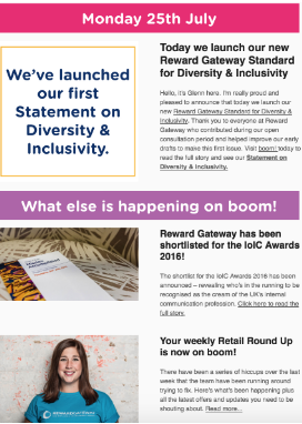
 Here’s an example of yesterday’s email that went out to our employees. We follow this format each time and we’re averaging a 77% open rate and 23% click through rate.
With an industry average click through rate of 1.6% (for marketing emails), it’s awesome to see the formula we began and stuck with has proven itself as working! Since we host our actual content on our SmartHub® platform, we have access to full reporting on user engagement and great interactive features such as likes and comments.
Here's how simple it can be:
- A headline
- Two-sentence summary
- Options to click through to the full story
How to make it beautiful: Use images wisely.
The final tip I want to give you for today is on making your email stand out among the rest. You want your email to be full of personality, and you want it to convey your company brand and tone before they’ve even begun reading it.
Using images is a surefire way to capture the eye of your audience. They say a picture says a thousand words, so use yours carefully to convey your story and reduce the amount of copy you need to include in your content. To avoid getting marked as spam, you want to stick with a 60/40 text-to-image ratio.
There are many different websites that you can use to create beautiful emails, but my absolute favorite has to be Mail Chimp. They make it so simple with templates and themes already available (we use one of the basic ones for our boom! emails). Or, if you’re feeling a bit more creative you can make your own up yourself. It allows you to add video, links, images and all sorts of content using a really simple drag and drop function and I have no doubt that, just like me, you’ll be creating beautiful, engaging email content in no time.
With nearly 40% of employees already having voluntarily signed up to receive our daily roundup email at Reward Gateway, it just goes to show, email isn’t dead, it’s reinvented itself.
Isn’t it about time you did, too?

 Catrin Lewis


