7 min read
We recently moved our entire London headquarters, making the new headquarters as “RG” as possible while also taking care to design workspace for employee engagement. While we’re excited to share more of the behind the scenes looks at our new offices, we thought it made sense to start with one of the masterminds behind the new design: our own Creative Director Sevil Rahimova.
She talked to us about the multiple layers of design that went into the new office, the weirdest decision she had to make and insight into how the new office complements a variety of work modes:
How long have you been with Reward Gateway, and what’s your role?
I’m the Creative Director at RG and have been part of the RG family for two and a half years now. As creative director I’m tasked with creating and maintaining our brand consistency, so everything we do feels very “RG.” Everything from creative direction on our website to one-off marketing materials or sales tools or videos comes across my desk.
What were your first impressions of the older Reward Gateway office?
Funnily, my first impression of RG and the London office was before I joined the company. I used to work for Dazines (acquired by Reward Gateway in 2014) and the Managing Director Seb and I came to the office in 2012 to do a pitch for a web project.
While I was waiting in the reception area, I watched one of the RG videos running on the screens and I thought: “What an exciting company this is!” I loved the strong emphasis on brand and the use of video as medium to connect to the audience. At that time the office was split in multiple small rooms, which was not the best formula for collaboration. On top of that, the company occupied three floors, which made it hard for staff to get to know each other.
And now?
Needless to say, 265 TCR (what we call our new office) is the daytime home for the London staff.
As we started the design, over a year and a half ago, we realized we spent more of our conscious time in the office than at our homes, so it was extremely important that we got it right for our people.
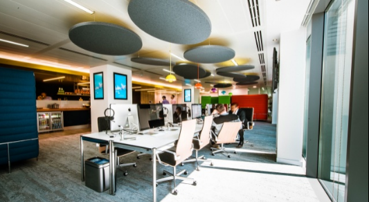
Our new office is on a single open-plan floor that has improved the cross-team communication and collaboration massively. It’s also built with flexibility in mind, giving staff variety of different spaces that fit their particular task at hand, and the office redesign promotes employee engagement. We’ve used Herman Miller’s Living office approach to activity based working.
Tell me about some of the decisions you had to make as the creative lead on this project.
The weirdest one was definitely the surreal conversation with Glenn about soap smell. We had a 2-hour long chat discussing what RG smelled like. Was it like roses, citrus or was it something else? We really took “attention to detail” to a whole new level.
Initially, the nice deep window seals alongside Tottenham Court Road weren't being used, so we tried to find a way to make the most out of the view and bundles of light coming from the full-height windows. As a result, we decided to use vibrant cushions in our brand colors to upholster the seals and turn them into low Balcony seats that have been proving very popular for casual catch ups.
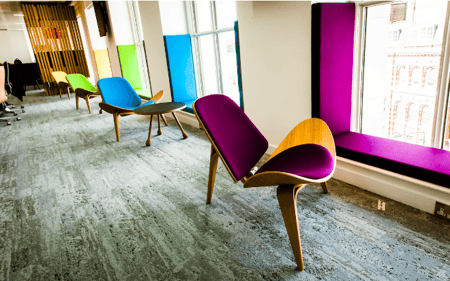
The most frustrating decision of the lot was when I decided that we were going to use dry transfer to showcase the story of the selected furniture. Dry transfer is generally used to present artwork captions in galleries and museums and is genuinely the most beautiful way to tell a story on a wall.
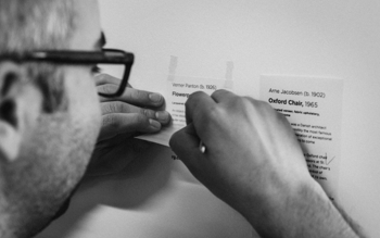
What we weren’t prepared for was the multiple failed trials on getting the tiny individual letters to stick to the freshly painted wall. Simply put, I created three days of hell for myself and Norberto - our Senior Designer. We did manage to achieve the most amazing result, but only Norbie and I know what was the cost we paid. So a word to the wise in the future, plan out your wall decoration (and the time it will take!). I’m really proud of the descriptors and explanations we have throughout the office to show staff and visitors why we made the decisions we did, but it certainly was time-consuming!
Where did you find inspiration for the new offices?
Everywhere! We were determined to go into this battle well prepared and I can testify that there was no rock unturned looking for the best designed furniture, most innovative ways to support flexible working and employee engagement, or small RG details to bring our new office to life.
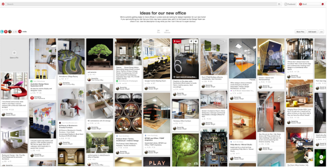
First, we asked our staff to contribute their ideas to a shared Pinterest board. That really helped us uncover what our people liked and what was the expectation from our new office.
Next, a company called Aberley came in to assess how we were using the 90 Westbourne Grove office at different points of the day. The assessors looked at how we used desks, manager offices, meeting rooms, breakout spaces and even printers every working hour over five days. As a result, there were 50 observations of each of these areas.
It was eye-opening. Here’s a snapshot of what the assessors discovered:
-
The overall utilization of the space was 45% (UK’s average is 48%)
-
Thirteen percent of our desks were left unoccupied throughout the day.
-
Nearly 30% of our desks were used one day or less per week
-
There was a need for more spaces for solitary working
-
We needed more ad-hoc meeting space for 2-4 people
We used the results of the assessment and aligned them with the 10 work modes in the activity based approach to make sure that no matter what kind of work our staff do — individually or together, we have the right spaces for them to achieve the best results. We also visited some client spaces that had recently redesigned their offices to get notes on the process, pitfalls and best practices. One tip they had: Keep carpet in the quiet areas to reduce noise even more.
How critical was considering company culture in finalizing design?
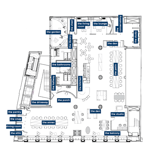
It was the most critical aspect of the whole project actually. At the end of the day, this office was for our people. It was our duty to reflect Reward Gateway’s unique culture and align every design decision with our staff’s needs and aspirations. Because the staff really does consider the new office “home,” we decided to name the spaces with the names of the room in a house, like the porch, the driveway, the lounge, etc. It makes us stand out a bit from the boring “Conference Room A” that people might be used to!
We’ve consulted with our people every step of the way through feedback sessions. Just yesterday we went through their latest feedback that will change up how store our bags on a daily basis by moving one of our book sections to a new location, so it will free up extra shelves for bags that are on the floor. We’re also reconsidering the right work mode for The Garden, because we realized that the staff uses the space differently from the initial plan, which was to be tech-free. We’ve found that people like to use it for bigger brainstorming sessions. So we’re going to run some two-week trials to see which mode works better.
For those thinking of starting their own office redesign, where should they turn?
Herman Miller Living Office: Good for introducing the activity based working modes
Dieter Ram’s Ten Principles of Good Design: This was a guiding light when it comes to best design practice and how creatives should look at products.
AreaSq: Interior design experts
Clerkenwell Design Week: Amazing for inspiration and discovering some new talent
Material Lab: Experts in all materials and surfaces
Brightspot: Space strategists
What was the biggest “wow” moment for you?
Sharing the Garden was exciting for me. In our last office, we had a great outside space, so we had to figure out a way to bring the outside in. We achieved this by adding an abundance of plants and even an edible chili and herb patch that our cafe staff can use in prepared lunches.
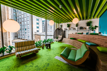
Based on the feedback so far, it seems like there’s a deeper appreciation for the office, and how workspace can so critically affect engagement. When I look around, I see happy, motivated faces and a larger sense of collaboration than there was before. I’m excited to see how we continue to adapt to our new surroundings!

 Chloe Thompson
