I recently joined Reward Gateway as the Internal Communications and Engagement Specialist, which is a role that heavily uses boom!, our employee engagement platform, for any and all communications. I have used various forms of internal communications tools before, intranets, emails and surveys but had never really come across something like this.
Our technology takes all of the internal communications processes and combines them into one world.
Of course, as tech savvy as I think I am, there’s always a learning curve to understand new technology. With that, I'd like to share the top five things I’ve discovered while becoming a boom! power user:
1. Think 'smart' to get ahead
Our suite of 'Smart Products' (pages, blogs, hubs and surveys) are exactly that, smart. A new dashboard is always daunting but the products are made to be intuitive. To create new layouts or pages, it’s as simple as dragging and dropping what you want in place, whether that’s images, text, video or even the well-placed GIF or two! I love that I can change the look and feel of our hub in a matter of minutes.
Our Pages are used for text-heavy content. We use pages to highlight things that won’t change frequently, such as critical office information for visitors. It’s easy to add pictures and maps (another great one to use for office info!).
Our Blogs are daily updates that we use to inform the global company on topics that are important to the business. Our CEO sends out weekly leadership blog updates that we call Mission Mondays that let everyone know what he’s focussing on and where he will be for the week. It’s a great way to make sure everyone is on the same page.
Our Hubs are interactive sites that will host more information. Hubs link to pages and can show a newsfeed of blogs. It’s top-level information that typically includes links for deeper dives into the subject matter.
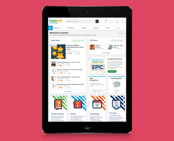
They all fit together to form one big platform, or 'hub' of content. No two are alike. For us, boom! has been around for the last four or so years as our main hub for employee communications, but it’s also where we house benefits information, office information, helpful resources and much more! Take a peek below:
Learn more about the evolution of our boom! platform »
2. Copying previously made pages
We use multiple hubs for different campaigns throughout the company. I always find that copying a previous hub is a great way to start. I don’t like a completely blank slate, it’s easy to make a hub completely unique while still keeping the same style and formatting.
This sometimes does mean deleting a decent amount but building off of a base makes it easier for me to visualise what the Hub should be. I have a few template hubs that I use when creating new team introductions, for instance.
Using a template helps reinforce what the viewer is looking at because it creates a visual pattern for that content.
3. Pages are a great way to introduce unique things about your office
As we use these SmartHubs for a lot of our core landing pages, Smart Pages are a great way to drill down on some of that information.
When considering whether to use a page versus a hub, I think of a page as information in one read, while I think of a hub for top level information with the opportunity to read more, so the hub has pages within it that contain more information.
There are countless ways to use pages, but one of the ways we use them is to showcase our different offices and teams across the globe. They include details about who should be your first point of contact, how many meeting rooms are there and sometimes even what snacks are in the office!
It’s great to know where the offices are but that extra bit of info really makes it feel like we can jump into that office and get to work.
We also use pages for information that will be long-lasting, like details about our employee benefits programs or our global coffee break app, Donut Time. It’s information that is useful but won’t change frequently. We can also broadcast this information on our boomTVs across the globe.

4. No need to manually pull data – it’s right there for you!
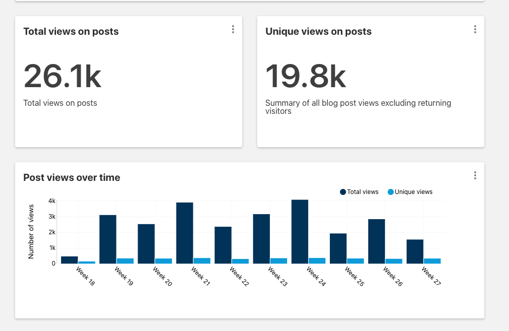
As the internal communications and engagement exec, I need to see that I'm actually being effective. With our communications engagement analytics and reporting, administrators of the platform can see stats like:
| 1. Most popular posts |
| 2. Top bloggers |
| 3. Total views |
| 4. Unique views |
| 5. Reactions |
| 6. Comments |
The data will pull the views by month so you can see if a certain blog post has continued interest or if there’s a particular subject that brings in the viewers.

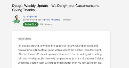
Here's a peek at one of the latest posts from our CEO:

Our top blogs this past year were our weekly CEO blogs, Friday People news and Global business updates. Each one keeps our employees in the know of what is happening in every office.
Our Mission Monday blog by our CEO is a fan favourite because it jump-starts our week and keeps the company aligned with our mission.
In developing an employee communications calendar, this can help you narrow down themes. For instance, if you see an uptick in views on blogs about employees volunteering or doing charitable events, maybe you could do a weekly blog dedicated to how your business showcases corporate social responsibility. Likewise, if you have a blog that has low readership but it’s an important topic, that could signal that you need to try out a different format or test out a headline.
5. Don't be afraid to turn off or delete information
As our company continues to grow, so do our pages, blogs and hubs. It’s always good to take a moment and see what can be cleaned up. We have employee communications campaigns, like our company Hackathon, that only run for a short period of time. Instead of leaving a hub active, you can turn it off after the event. This means that you’re not losing the information you may need in the future but that there isn’t an inactive hub live on your site.
Same goes for deleting things, if inactive pages (or even active ones) aren’t needed, delete them. It will clear up your account and make it easier to find things, or even encourage you to update some information.
As you get settled into the Smart Products, you’ll find your own ways to incorporate them into your workflow. It’s all about what suits your needs and how you can better communicate with your company.
If you’re interested in learning more about how we’ve evolved our internal communications, feel free to reach out to me on LinkedIn.
 Kristen Peters


